
The purpose of a Call to Action (CTA) is to encourage a visitor to take a desired action. Usually this action is to engage with an offer you are providing: the downloading of an ebook, registration for a free trial, subscription to a newsletter, etc. That offer resides on a landing page on your website, but visitors won’t know how to get there without seeing an enticing CTA elsewhere on your site.
Visitors need to see and be enticed by that CTA. They are the key to lead generation but they need to be done right to convert traffic into leads.
Here are 6 things to avoid when creating a CTA:
- Create a scrawny-looking button.
Consider all of the text and images on your page or blog—even those in any sidebars. Your CTA shouldn’t have to compete with them because it is more important. It doesn’t have to be overbearing, but your CTA button should stand out and reside above the fold. - Use clashing colors.
To spin off of the above note, color is just as important as size and location. Keep it within the realm of your branding so that it “fits in” with your site and doesn’t look spammy. - Offer no value.
Contact forms and newsletter subscriptions are probably the most popular types of CTAs. But what instant value is the visitor receiving? Not much. Get creative and offer free guides, white papers, tip sheets, and other means of instant gratification. - Make it difficult to take the next step.
If your CTA is a colorless anchor link, an image that looks like others on your page, or any other element that could potentially blend in, your visitor may not know to click it. Be clear! Create a CTA that looks like a button with an actionable command. - Think more is more.
More is not more… more is confusing. Keep your command between 1 and 4 words when possible. “Download SEO White Paper” is much easier to digest than “Click to Download Your Free White Paper About Good SEO”. - Forget to test it.
Rookie mistake. How can you ever measure how well your CTAs are doing without having elements to compare? Try different colors, language, placement, and offers throughout your site.
Avoid these 6 missteps and we promise you’ll drive more clicks and leads on your website.
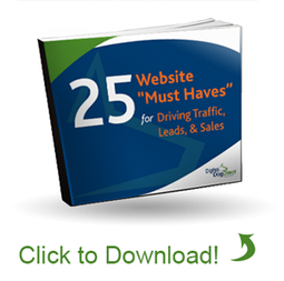
Does your website have what it takes to be a traffic-driving lead-generator? Find out in this free ebook download: 25 Website “Must Haves” for Driving Traffic, Leads, & Sales
Comments