
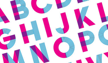
 By some estimates there are 25,000 font families available for use in designing printed materials. With an endless array of typefaces at your fingertips how do you begin selecting fonts for use in any given print project from direct mail to sales sheets to brochures?
The first place to look for font guidance is to a company’s corporate identity manual or brand standards guide if one exists. Such a document presents guidelines for a graphic design system that designers must follow. At minimum it addresses color palette, logo use, and the various fonts recommended for use in print.
In the absence of a brand standards guide, you have the opportunity to establish a set of fonts that will work well together, not only for the job at hand, but also for future use. You may find a few threads of font continuity across the company’s work of late, but now it can be more formalized as you introduce new fonts to the family.
Before beginning a search for the perfect fonts, let these 3 rules of thumb help guide your decision:
1. Communication is the Goal
Don’t let fonts get in the way of readability. The #1 priority of most print messaging is to impart knowledge that instills enough desire for the reader to take some kind of action. Since you only have a few seconds of attention span to work with, the typeset words must be easy to speed-read. To that point, set the body copy at a minimum of 10-point type when designing hand-held collateral, direct mail, or similar pieces.
2. Exude Brand Positioning
Describe the brand using adjectives such as classy, serious, playful, edgy, techy, luxurious, corporate, historic, humorous, and so on. Then choose fonts that can also be described by the adjectives.
For example, an invitation to a financial planning workshop may call for a sophisticated, upright serif font that subliminally says, “Invest wisely.” On the other hand, a postcard announcing the lineup at a comedy club might do well with a jovial, round sans-serif font that says “Fun!”
Warning: don’t go overboard. See next point.
3. Keep it Simple
You only want to specify a few fonts and type sizes for each single project. A bold sans-serif headline can pair well with a contrasting serif body copy font. Subheads can be set in the same font family as the headline, but in a lighter face. It starts to get messy (and hard on the eye) when you see several different typefaces in multiple sizes on a page.
A solid foundation for a company’s font usage will keep brand positioning and recognition consistent across the board—brochures, direct mail, presentations, and corporate communications. You can build on this foundation on a case-by-case basis with special fonts designed to align with specific audiences, occasions, and promotions.
A big, bold “TWO-DAY SALE!” set in a big, bold, super-chunky serif font might work for a warehouse clearance sale. Or a patriotic “Happy 4th of July!” set in a serif Americana font can work in the context of an Independence Day promotion. In both cases the materials can still retain the same look and feel of the brand.
Hundreds of fonts may work well from a pure design perspective for any particular project. But when you are purposeful in the selection based on staying true to brand identity, you will find just the right type.
Comments