
 Today’s digital printers allow designers to create stunningly colorful designs that are amazingly affordable to print. However, an overly-exuberant use of color may not serve the purpose of direct mail design, which is to elicit a response.
Yes, you first need to attract attention, which can be accomplished with a loud, brightly colored piece that screams, “LOOK AT ME!” But then the rest of a direct mailer’s job is to sell. Unless that would be assorted flavor packs of unicorn rainbow candy, it would behoove you to be judicious with the use of color in direct mail.
Three Guidelines for the Use of Color in Designing Direct Mail
- Establish a Color Palette
Start with colors used for the brand logo and corporate identity. Then you can add harmonious colors to the scheme. There are many resources to help guide designers in choosing color combinations. Among many books on the subject is the classic tome, Color Inspirations, which provides 3000 color palettes featuring values for digital printing. By conducting a little research, you’ll be more likely to select colors that pair and contrast well together.
- Place Color in Context with the Offer and Audience
Hues of blues exude trustworthy products and services. Greens and browns can indicate a down-to-earth sense of sustainability. Gold and purple signify affluence. Red and pink can be attention getters as well as speak the language of love. Yellow and orange are warm and cheerful. Pantone offers a Guide to Communicating with Color which provides numerous color combinations based on color psychology, with recommendations for effectiveness in the marketplace. Or, dig into color theory by searching “psychology of color in print” on the web.
- Limit the Number of Colors in Each Piece
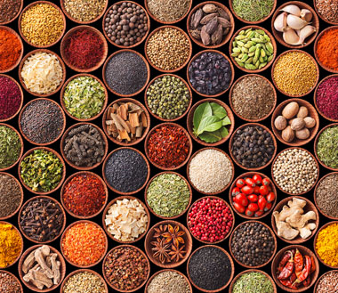
Color is but one element of a direct mail package or postcard. Think of it as the spice of direct mail design. It adds flavor to the fonts, headlines, copy, photography, and even the use of white space. If you add too much, you risk overwhelming the senses, or worse, conveying a cheap, unprofessional image.
Once you establish a color palette, you can then scientifically test the colors within it. Experiment with different dominant and accent colors based on the target audience. Discover what colors work well by gender, age, or income. Conduct A/B tests and measure results by response and actual sales. Ultimately you will arrive at formulas that work best across the spectrum of your direct mail campaign.

Comments